
A brief biography of Josef Muller-Brockmann:
Josef Muller-Brockmann (May 9, 1914 - August 30, 1996) was born in Rapperswil, Switzerland, where he also completed secondary school.
In 1930, he started an apprenticeship as a graphic designer.
In 1932, he studied at the Zurich Kunstgewerbeschule (school of Arts and Crafts), under Ernst Keller.
In 1934, he became a freelance graphic designer in Zurich.
In 1936 he opened his studio in Zurich specializing in graphic design, exhibition design and photography.
He served in the army from 1939-1945, then worked in theatre and exhibition design, and as an illustrator until the 1950's.
From 1958-1965 he was co-editor of "Neue Grafik" (New Graphic Design) Magazine.
He eventually succeeded Ernst Keller in the Graphic Design Department at the Zurich Kunstgewerbeschule from 1958 - 1960.
In 1966 he was appointed European design consultant to IBM.
[1]
Muller-Brockmann wrote several books throughout his life, including:
"Gestaltungsprobleme des Graphikers/The Graphic Designer and his Design Problems" - 1961
"Geschichte der visuellen Kommunication/A history of Visual Communication" - 1971
"Mein Leben: Spielerischer Ernst und ernsthaftes Spiel" - 1994
"History of the Poster" (with Shizuko Muller-Brockmann) - 1971
"Grid Systems in Graphic Design" - 1981
"Photoplakate: von den Anfangen bis zur Gegenwart" (with Karl Wobmann) - 1989
[2]
The Swiss Automobile Club Poster:
In 1952, he designed an abstract, three dimensional public signage for the Swiss Automobile Club which was set up in Zurich. It included an "Accident Gauge" which advertised the hazards of driving, showing a summary of each week's total automobile-related accidents and deaths.
His first poster success was for the Swiss Automobile club ("Watch that Child!") which gained him reputation as a designer. This poster showed Muller-Brockmann's use of photography and typography, rather than illustration. He believed in socially resonsible design and showed this through his health and safety posters. [3]

He was greatly influenced by work in the 1920's and 1930's, and inspired to switch design styles from Individualist illustration to Anonymous graphics by designers such as Richard Paul Lohse and Carlo Vivarelli (with whom he later developed "Neue Grafik" with). [2]
Poster Series at the Zurich Tonhalle:
The poster series Josef Muller-Brockmann is most well known for is which he designed for the Zurich Tonhalle. He began producing concert posters in 1951, and continued until 1972. These posters created a mathematical harmony which reflected the harmony of music. [3]
Some examples are shown here:


A Pioneer of the International Typographic Style:
The Swiss International Style, later known as the International Typographic Style was marked by several distinct characteristics:
1. The use of a mathematical grid to provide an overall orderly and unified structure
2. The use of sans serif typefaces in a flush left or ragged right format
3. Black and white photography in place of drawn illustration [4]
The overall impression was simple and rational, tightly structured and serious, clear and objective and harmonious.
The Swiss International Style took influences from Constructivism, Elementarism and Minimalism movements. The design was about communicating a message in a very clear and precise way. Typefaces such as Akzidenz-Grotesk, Helvetica or Univers helped with this neutral, clear communication. [6]
The Swiss International Style was refined at a design school in Basel, led by Armin Hofmann and Emil Ruder, and also in Zurich under the leadership of Josef Muller-Brockmann. All of these designers had studied with Ernst Keller at the Zurich Kunstgewerbeschule before WWII, where the principles of the Bauhaus and Jan Tschichold's Modern Typography were taught. [5]
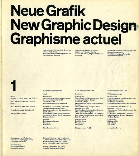
Neue Graphik:
The magazine "Neue Grafik" was an important factor in establishing the international influence of the Swiss Style. The co-editors consisted of Josef Muller-Brockmann, Richard Paul Lohse, Hans Neuburg and Carlo Vivarelli. The magazine was first published in 1958 and closed in 1965. The aim of the magazine was to demonstrate first, that the practice of New Graphic Design Design was fundamentally Swiss, the second that it was definitely Constructive and third that it was a logical development form Modernism. The magazine was written in German, English and French. three major languages of Switzerland.
Grid Systems:
Grid Systems were a way of helping graphic designers keep a logical and consistent organization of information. They were in important factor in the International Typographic Style and were presented by Josef Muller-Brockmann in his book "Grid Systems in Graphic Design". Grid Systems are still an important tool used today for structured design in both print and web design. [6]

Switzerland Post WWII:
Immediately after World War II (due to its neutrality during the war), Switzerland was able to recover much faster that the rest of Europe, since it already had a powerful commercial, financial and industrial base. Zurich developed as an international banking and insurance centre, and other international bodies set up in Geneva, gaining the country wealth and respect. Imports and exports increased dramatically from their pre-war levels. A large number of foreign workers began arriving in Switzerland in the 1950's.
Switzerland, having three major languages at the time needed a clear and concise way of communicating messages. The International Typographic Style proved to be an effective way of achieving this, influencing the popularity of designers using this style. Internationally, this problem seemed to occur as well, aiding the spread of the Swiss Style to help with world-wide communications for events such as the Olympics. [7]
Munich 1972 and London 2012 Olympic posters:

 [8]
[8]  [9]
[9]
References:
1. ^Author - Unknown http://www.filterfine.com/resources/jmb/bio.htm
2. Hollis, Richard - Swiss Graphic Design 1920 - 1965 : The Origins and Growth of an International Style
3. ^Author -Unknown http://www.all-art.org/art_20th_century/design/d8.html
4. ^Author -Unknown http://www.designhistory.org/posters.html
5. ^Author - Unknown http://www.internationalposter.com/style_primer/international-typographic.aspx
6. ^Author - Unknown http://www.smashingmagazine.com/2009/07/17/lessons-from-swiss-style-graphic-design/
7. ^Author - Unknown http://www.swissworld.org/en/history/the_20th_century/the_economy_after_world_war_ii/
8. ^Author - Unknown http://www.1972municholympics.co.uk/Posters/Poster_Cultural_Section.php
9. ^Author - Unknown http://www.simonswork.com/blog/wp-content/wp-images/2009/05/olympics-posters.jpg
Comments (0)
You don't have permission to comment on this page.