Edward Johnston Railway Type
click above for Wiki information


Edward Johnston 1872-1944
More information click above - Wiki
Born Feb. 11, 1872, Uruguay
Died Nov. 26, 1944, Ditchling, Sussex, England
Overview:
British craftsman and teacher of calligraphy, his work influence 20th-century typography and calligraphy in England and Germany. Johnston along with Rudolf Koch, has been credited with starting the modern calligraphic revival. [16] Type designer of Johnston Railway typeface originally named the “Underground.” [3]
Edward Johnston is most famous for designing the typeface sans-serif Johnston typeface in 1916 and the redesign of the Roundel in 1918, used throughout the London Underground, or the Tube - London's rapid transit system. In the 1980's the Johnston typeface was redesigned, as well as the roundel. New Johnston typeface was produce in 1979 by Eiichi Kono at Banks & Miles to replace sans-serif Johnston typeface. [2]
He inspired many students by his teachings, at the Central School of Arts and Crafts in London’s Southampton Row, one influenical student was typeface designer and sculptor Eric Gill, well known for is typeface Gill Sans. Eric Gill was also known as a stonecutter and printmaker associated with the Arts and Crafts movement. [20] The school had five major departments that included furniture, printing, silver and goldsmithing. [5] [16]
Education:
Johnston’s father was a Scottish military officer. Johnston was brought to England as a child from Uruguay and received early education at home. [16]
Attended the University of Edinburgh until 1898 taking medical studies, he then went to London, where he began the study of medieval manuscripts at the British Library and executed calligraphic commissions. [1]
In 1899 W.R. Lethaby, asked Johnston to teach writing and lettering classes at the London Central School of Arts and Crafts in 1901. He taught there until 1913. [5]
William Lethaby founder of the Art Workers' Guild in 1884 and the Arts and Crafts Exhibition Society in 1889, an English architect and educator introduced Johnston to Sydney Cockerell a former secretary and librarian to the English designer William Morris, who had encouraged him to look at certain manuscripts in the British Mu seum. Influenced by Cockerell, Johnston regained techniques for using and making reeds and quills. [5]
Written works:
Writing & Illuminating, & Lettering (1906) (online look at his book), Information on writing procedures and aesthetics, followed by Manuscript and Inscription Letters (1909).
1913 Founder member and editor of "The Imprint" magazine, of which there are a total of nine issues. [17]
Works:
Johnston’s type came from his calligraphy at an influential time for an Arts and Crafts Movement becoming increasingly involved with the problems of industrial design. [18]
More typography pictures by Edward Johnston here.
1910-1930s Edward Johnston designed fonts for the Cranach-Presse in Weimar, which was owned by Count Harry Kessler. Kessler commissioned Eric Gill and Edward Johnston to draw title pages for Insel Verlag. [6] [18]
1928 An edition of "Hamlet" is published with Johnston’s Hamlet-Type and woodcuts by Edward Gordon Craig. [6]
1930 Designs a Greed alphabet for Count Harry Kessler’s Cranach-Presse in Weimar, only a few of the letters were cast. [4] [18]
The London Underground Railway commissioned Edward Johnston in 1915 to create a new alphabet for its signs and publicity (corporate identity), he finished a sans serif typographic design in 1916. His design was a success and is considered the first modern sans serif type based on the proportions of Classical Roman capitals, Johnston is a humanist sans-serif typeface. Johnston also redesigned the Roundel in 1918. [4] [16]

The final product, from the collection of Mike Ashworth
Frank Pick Commercial Manager of the London Electric Railway Company was also known as 'The Underground Group'. [1] [10]
Frank Pick © TfL/London's Transport Museum


[13] Click on image to enlarge
Edward Johnston's first drawing (above), dated 6 February 1916, for the London Underground alphabet (actually, a later lithographic copy, not the original drawing). [13]
Image from the Edward Johnston Foundation click on his name above.
Johnston’s other sans serif type designs for London Transport included the condensed Omnibus alphabets and a bold version of Johnston Sans. Also reproduced for the first time, designs for silver medallions presented to the Underground’s best kept stations, and a selection of his bullseye designs for London Transport. [7] [16] [21]

 [11] Johnston Sans Printing Blocks

An early station nameboard of a type introduced in 1908
© TfL/London's Transport Museum

The new roundel, c.1918
Design: Edward Johnston
© TfL/
London's Transport Museum
The redesigned roundel by Edward Johnston in 1918.

Original drawing for the London Underground roundel symbol Design:
Edward Johnston © TfL/London's Transport Museum
Teachings:
Johnston’s teaching conveyed the fundamental principles that writing and printing are interdependent. Some of his students who later became well-known calligraphers, teachers, and designers of letters were Anna Simons, Eric Gill, Graily Hewitt, Thomas James Cobden-Sanderson, Percy Smith, Dorothy Bishop Mahoney and Irene Wellington. [16]
Johnston's students in 1921, founded the Society of Scribes & Illuminators, calligraphy society. [19]
Eric Gill, (1882-1940), is remembered today as a wood-engraver, type designer and sculptor and student of Edward Johnston’s. [20]
In 1944 one of Johnston’s students, Irene Wellington succeeded him at the Royal College of Art, where her teachings influenced another generation of calligraphers and illuminators. [16]
Architecture - With the Johnston typeface and Roundel.


Architecture From Left to Right [9]
- Hammersmith station, 1956 © TfL/London's Transport Museum
- London Underground station architecture, 1930s Design: Charles Holden © TfL/London's Transport Museum
Advertising posters - created with the Roundel design, pictures from the London Transport Museum.
Johnston Sans used.


Posters From Left to Right [9]
- Speed, 1930
Design: Alan Rogers
Advertising poster
© TfL/London's Transport Museum
- Power, 1931 Design: E. McKnight Kauffer Advertising poster © TfL/London's Transport Museum
- Thanks to the Underground, 1935 Design: Zero (Hans Schleger) Advertising poster © TfL/London's Transport Museum
- London Transport - Keeps London Going, 1939 Design: Man Ray Advertising poster © TfL/London's Transport Museum
Influences on Type and Design in the 20-Century:
1765 ce - 1900 ce
The Industrial Revolution brought advances in technology, modernized new production methods and materials during the development of type, design and the visual arts in a dramatic way, influencing the look, quantity that could be produced and increasing the mass production of commercial products. In a relatively short period of time people were having to adjust to huge economic, social, environmental and aesthetic changes. It was a time full of new conveniences and innovations, people were having to either welcome the changes or disagree with the modernization and impact these changes had. There was a feeling of loss in quality and individuality sacrificed in the name of progress with the progression of printed materials being adopted at this time. [14] [15] [18]
The Industrial Revolution ties most the artists and craftsmen in the 20-Century, with what was going on at the time in Europe, with mass-produced decorative arts. It changed handcrafted metalwork, jewelry, wallpaper, textiles, furniture, and books. [15] Basically it came down to the Arts and Crafts Movement was old school and not practical in the "modern world." By the progressives of Industrial Design Movement. Mackmurdo helped organize the Century Guild for craftsmen. These men revived the art of hand printing - William Morris, John Ruskin.
In the 1830s - Consumerism was increasing on a variety of products being produced and sold. The average middle class had buying power now, where before it had been for the wealthy and elite. [15]
Paper and papermaking techniques were becoming affordable, lithography printing and wooden type had advertisers and manufacturers saturating the market with bold ornate advertisments, announcements, documents and illustrations. [15]
In 1891 - William Morris founded the Kelmscott Press - a small private press. Morris was an influencial craftsmen, artist, writer and founder of the Arts and Crafts Movement. Private presses of other designers soon followed Morris, in opposition of mass production of industral Design Movement. [18] The emphasis was on high-quality design and hand production; handmade papers and hand-cut typefaces. Still using medieval aesthestics of fine craftsmen to illuminate books. [16]
Effects the Industrial Revolution had on the Arts & Crafts Movement in Germany the late 1800s - Online articial from Warsaw Museum of Design.
Hermann Zapf early works were influenced by the calligraphy and the work of Rudolf Koch and Edward Johnston. [11] Designed palantino, Melior, and Optima.
Societies and Movements:
Edward Johnston was a leading member of the artistic community, known from 1920 as the Guild of St Joseph and St Dominic. He was also President of the Arts & Crafts Society (1933-6) and was awarded the CBE in 1939. [4]
Arts and Crafts Movement
Art Workers' Guild
The Arts & Crafts Society
Arts and Crafts Exhibition Society
Alliance Graphique Internationale (AGI)
Royal Designer for Industry
International Council of Graphic Design Associations (ICOGRADA)
Society of Scribes & Illuminators (SSI)
American Institute of Graphic Arts (AIGA)
Influences By Johnston Typeface Today:
Although the original Johnston sans-serif typeface was modified by Eiichi Kono at Banks and Miles in the 1979 to produce "New Johnston" it is well know today associated with London's Underground and Eric Gill's typeface "Gill Sans" takes inspiration from Johnston typeface, as well as other type designers past and present. [22]
P22 Type Foundry - You can purchase Edward Johnston's 1916 typeface for commercial use, his typeface lives on.
Typefaces Produced Since:
ITC Johnston - Produced in 1999 by British type designers Richard Dawson and Dave Farey. In 2002 the typeface was also released in a open typeface.
ITC Johnston Pro - released in March 2009. [22]
P22 versions - Johnston Underground - Underground Pro Family -
London Transport Museum licensed the original Johnston typeface exclusively to P22 Type Foundry in 1997. [22]
Commerically as "Johnston Underground". Released as Underground Pro Family (or P22 Underground Pro). [23]
"P22 type foundry is a digital type foundry from Buffalo, New York, that develops and markets typefaces for the Macintoshand Windows platforms." [24]
New Johnston - redesigned in 1979 by Eiichi Kono - at Banks and Miles
Typeface for Transport for London: How Johnston Sans was saved by Eiichi Kono, Graphic Designer.
- I970s the need to revivitalise the Johnston typeface was pressing with new typefaces amerging and printing technology London's Transport image was deteriorating. [22] [23]
Johnston Delf Smith - original font was developed in 1920s by Percy Delf Smith former student of Edward Johnston. [23]
External links:
• Transport for London - Font requests
• London Transport Museum page on Johnston Sans (via web archive)
• London Transport Museum Photographic Archive
- Example of Johnston font used on an information sign
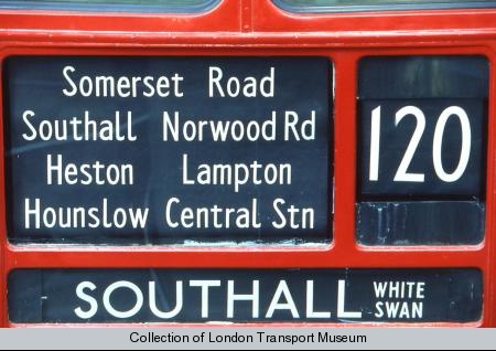
- Example of condensed form Johnston font used on a bus blind
The Society of Scribes and Illuminators
See also:
• Public signage typefaces
• Rail Alphabet - the 1960s British Rail equivalent to Johnston
Books from the New Westminster and Burnaby Library: (Books pulled for general overview of the 20 Century.)
[14] Typographic design; form and communication by Carter, Rob, Day, Ben, Meggs, Philip
686.22 C246t Foot notes
[15] Exploring typography : an in-depth guide to the art and techniques of designing with type / by Tova Rabinowitz
686.22 R113e Foot notes on the Industral Revolution pg.16
History of calligraphy / by Albertine Gaurby Gaur, Albertine
745.6 G237h
Art of the printed book: 1455-1955; masterpieces of the typography through five centuries from the collections of...Blumenthal, Joseph1973686.2 B627a ST
Other Books:
Johnston’s Underground Type - By Author Justin Howes.
Is the first book to document Johnston’s work for London Transport. The book covers the design development of Edward Johnston’s Underground typefaces.
Blog:
http://londonreconnections.blogspot.com/2009/09/typeface-for-underground.html
http://en.wikipedia.org/wiki/Humanist_sans-serif_typeface
Online Archives:
Edward Johnston at the Crafts Study Centre
http://www.archive.org/details/writingilluminat00johnrich
http://www.archive.org/details/writingilluminat00johnuoft
http://www.archive.org/stream/writingilluminat00johnuoft#page/n7/mode/2up
http://designmuseum.org/design/london-transport
http://designmuseum.org/__entry/4837?style=design_image_popup
http://hans.presto.tripod.com/isbn/1854142313.html
http://artsresearch.brighton.ac.uk/research/academic/kono
Websites:
http://new.myfonts.com/person/Harry_Kessler/
http://www.linotype.com/733/edwardjohnston.html
http://www.answers.com/topic/edward-johnston
http://www.answers.com/topic/arts-and-crafts-movement
http://en.wikipedia.org/wiki/Edward_Johnston
http://www.flickr.com/photos/36844288@N00/3614176361/in/photostream/
Effects the Industrial revolution had on the Arts & Crafts Movement in the late 1800s. Oxford Journals
Journal of Design History 1990 3(1):59-62; doi:10.1093/jdh/3.1.59
© 1990 by Design History Society http://jdh.oxfordjournals.org/cgi/pdf_extract/3/1/59
Wapedia:
http://wapedia.mobi/en/Johnston_%28typeface%29
http://wapedia.mobi/en/Special:Search?search=edward+johnston+typeface+used+in+designs&sks=Search&r=topbox
Biography:
1908 The first version of the roundel ‘bar and circle’ symbol is introduced with a solid red circle.
1910–1930 designs fonts for Count Harry Kessler’s Cranach-Presse in Weimar.
1915 Edward McKnight Kauffer starts to design posters for the Underground Group.
1916 Frank Pick commissions the typographer Edward Johnston to develop a legible typeface for use throughout the Underground – Johnston Sans.
1918 Edward Johnston begins work on the redesign of the roundel symbol used by the Underground Group since 1908.
1920s Johnston Delf Smith - developed by Percy Delf Smith former student of Edward Johnston.
1928 An edition of "Hamlet" is published with Johnston’s Hamlet-Type and woodcuts by Edward Gordon Craig.
1930 Designs a Greed alphabet for Count Harry Kessler’s Cranach-Presse in Weimar, only a few of the letters were cast.
1979 Eiichi Kono - at Banks and Miles redesigned the Johnston to be New Johnston.
References:
1. ^Bull, John. (http://londonreconnections.blogspot.com/2009/09/typeface-for-underground.html : A Typeface for the Underground”) London, 2009 <!--accessed October 4, 2009-->
2. ^Child, Heather. (http://www.ejf.org.uk/ “Edward Johnston Foundation”) London, 2009 <!--accessed October 3, 2009-->
3. ^Author unknown. ( http://en.wikipedia.org/wiki/Edward_Johnston “Edward Johnston” ) San Francisco 2009 <!--accessed October 4, 2009-->
4. ^Author unknown. (http://www.answers.com/topic/edward-johnston “Edward Johnston”) <!--accessed October 4, 2009-->
5. ^ Author unknown. "Central School of Art and Design History". (http://www.aim25.ac.uk/cgi-bin/search2?coll_id=6247&inst_id=56) <!--accessed October 3, 2009-->
6. ^Author unknown Linotype GmbH. ( http://www.linotype.com/733/edwardjohnston.html “Edward Johnston”)Germany, 2009 <!--accessed October 4, 2009-->
7. ^Author unknown (http://en.wikipedia.org/wiki/Roundel#References “Roundel”) San Francisco 2009 <!--accessed October 4, 2009-->
8. ^(http://www.ltmuseum.co.uk/ “Edward Johnston”)London, 2009 <!--accessed October 4, 2009-->
9. ^(http://www.ltmcollection.org/roundel/about/detailedhistory.html?IXpage=2&_IXSESSION_=vKp7evYIK_c “Posters”) <!--accessed October 2, 2009-->
10. ^(http://www.ltmcollection.org/photos/results/results.html?IXsearch=signs&button=GO! “Photos”) <!--accessed October 2, 2009--> 11. ^ Kaihsu Tai (http://en.wikipedia.org/wiki/File:JohnstonSansPrintingBlocks.JPG “JohnstonSansPrintingBlocks” ) 2004 <!--accessed October 2, 2009-->
11. ^ http://www.aiga.org/content.cfm/type-design-influences-lloyd-reynolds-hermann-zapf-jack-stauffac?searchtext=Edward%20Johnston <!--accessed October 4, 2009-->
12. ^ http://designmuseum.org/__entry/4840?style=design_image_popup <!--accessed October 4, 2009-->
13. ^Johnston, Andrew and Angela. (http://www.vads.ac.uk/flarge.php?uid=68630&sos=4) Crafts Study Centre UK, 2008 <!--accessed October 4, 2009-->
14. ^ Typographic design; form and communication by Carter, Rob, Day, Ben, Meggs, Philip
686.22 C246t Foot notes <!--accessed October 4, 2009-->
15. ^ Exploring typography : an in-depth guide to the art and techniques of designing with type / by Tova Rabinowitz
686.22 R113e Foot notes on the Industral Revolution pg.16 <!--accessed October 4, 2009-->
16. ^ Robert Williams (<http://www.britannica.com/EBchecked/topic/305518/Edward-Johnston>) Britannica Online. 28 Nov. 2009 <!--accessed October 4, 2009-->
17. ^ Mike Ash Worth (http://www.flickr.com/photos/36844288@N00/3614176361/ "Imprint") Flickr 2009 <!-- accessed October 6, 2009-->
18. ^James M. Wells (http://www.britannica.com/EBchecked/topic/611830/typography/36794/Type-and-book-design-since-the-19th-century "Type and Book Design") Britannica Online. 28 Nov. 2009 <!--accessed October 4, 2009-->
19. ^Author unknown (http://www.calligraphyonline.org/abtssi.html "Society of Scribes & Illuminators") London, 2009 <!--accessed October 6, 2009-->
20. ^Author unknown (http://www.fontbureau.com/historical/EricGill "Eric Gill") Boston MA, 2009 <!--accessed October 6, 2009-->
21. ^Author unknown (http://en.wikipedia.org/wiki/Frank_Pick "Type Face Commission") San Francisco, 2009 <!--accessed October 4, 2009-->
22. ^Author unknown (http://en.wikipedia.org/wiki/Johnston_%28typeface%29#References "Johnston typeface") San Francisco 2009" <!--accessed October 4, 2009-->
23. ^Author unknown (http://www.absoluteastronomy.com/topics/Johnston_%28typeface%29 "Johnston typeface") Boston, MA, 2009 <!--accessed October 6, 2009-->
24. ^Author unknown (http://en.wikipedia.org/wiki/P22_Type_Foundry "Type Foundry") San Francisco 2009" <!--accessed October 4, 2009-->
Comments (13)
Kirsten Larsen said
at 1:38 pm on Oct 5, 2009
Wow there is a lot of information on here, good work!!
Kirsten Larsen said
at 3:57 pm on Oct 9, 2009
You should try and add some pics to make it more fun :)
CLO said
at 12:18 am on Oct 11, 2009
Not finished yet. Lots more to come... ;)
Susan Efting said
at 7:42 am on Oct 12, 2009
Very detailed/well researched and well laid out wiki Claire. Lots of graphics to clearly show Johnston's style - I was hoping to find something in them that might show he was inspired by my guy - Moser....but alas, nothing that I can see. Good work1
CLO said
at 4:05 pm on Oct 12, 2009
Unfortunately, I have found no direct links to the other Wiki posts others are working on. Thanks.
Anna said
at 7:56 pm on Oct 12, 2009
Mackmurdo knew Morris. If Johnston did we could make a connection.
CLO said
at 8:06 pm on Oct 12, 2009
Yes, I know.... All were craftsmen in the Arts and Crafts Movement. Mackmurdo helped organize the Century Guild for craftsmen. These men revived the art of hand printing. That is how thy are connected.
CLO said
at 8:13 pm on Oct 12, 2009
This is what I have found.
- In the 1890s the Arts and Crafts Movement became increasingly popular through other countries and growing international interest in design and with Art Nouveau.
CLO said
at 8:30 pm on Oct 12, 2009
Not sure if they have to know each other to make a connection. Just the movement maybe? The Industrial Revolution ties most the artists and craftsmen in the 20-Century, with what was going on at the time in Europe with mass-produced decorative arts. It changed handcrafted metalwork, jewelry, wallpaper, textiles, furniture, and books.
Basically it came down to the Arts and Crafts Movement was old school and not practical in the "modern world." By the progressives of Industrial Design Movement.
johnny de courcy said
at 8:49 pm on Oct 12, 2009
Hey Claire, great info, very in depth. One confusing bit of information i noticed is when you mentioned "roundel" it isnt linked or explained until the third time it pops up. I found that confusing, because I had no idea what a roundel was. haha until I read later. Link the first one for the dummies like me please!
Michelle Russell said
at 12:19 am on Oct 13, 2009
The posters using the roundel font is probably more in line with the beginning experimentation taking place in magazine design in the 30's since it was like a big empty canvas. This influenced the later magazine cover designers.
CLO said
at 12:50 am on Oct 13, 2009
Roundel Logos started as international military aircraft symbols - http://commons.wikimedia.org/wiki/Roundel#U
There was no Roundel font. Johnston typeface was used. Named the Underground; then Johnston Railway; then just Johnston.
CLO said
at 12:55 am on Oct 13, 2009
Hi Johnny, I had the Roundel linked under Johnston's "Works:" at the top. I have now added it also to the Overview: if that helps. Cheers.
You don't have permission to comment on this page.